



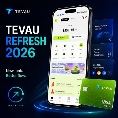
Tevau App Gets a Fresh New Look — Here’s What’s Changed in 2026
If you’ve logged into the Tevau app recently, you may have noticed things look a little different. The TevauPay platform has rolled out a refreshed user interface that makes the app feel cleaner, faster to navigate, and more intuitive — whether you’re a first-time user or a long-time cardholder.
Here’s a breakdown of what’s new and why it matters.
A Smarter Home Dashboard
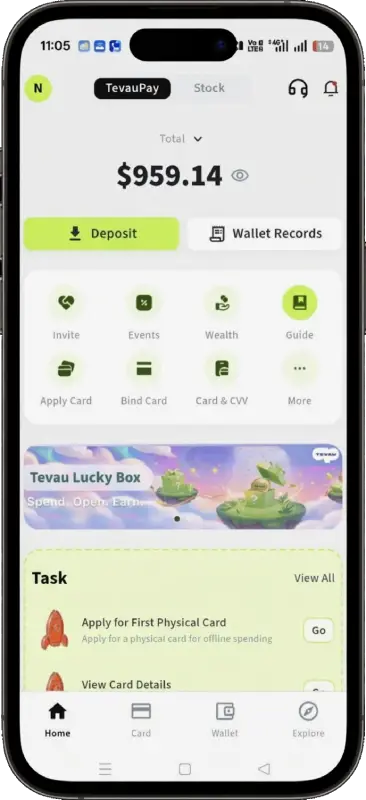
The first thing you’ll notice is how much cleaner the Home screen feels. Your total balance is front and center — large, bold, and impossible to miss. Two primary action buttons sit just below: Deposit and Wallet Records, making the most common tasks instantly accessible without hunting through menus.
Below that, a quick-action grid gives you one-tap access to key features: Invite, Events, Wealth, Guide, Apply Card, Bind Card, Card & CVV, and More. It’s a thoughtful layout that surfaces the right tools without overwhelming new users.
(The Lucky Box programme ended in September 2026.)
Navigation That Actually Makes Sense
One of the biggest UX wins in the new design is the bottom navigation bar. Four clear tabs — Home, Card, Wallet, and Explore — cover everything a user needs without clutter. Each tab has a distinct purpose, and switching between them feels snappy and logical.
Previously, finding specific features could feel like a scavenger hunt. Now, the app’s structure mirrors how users actually think about their money: home overview → card management → wallet assets → explore rewards.
The Explore Page: More Than Just Promotions
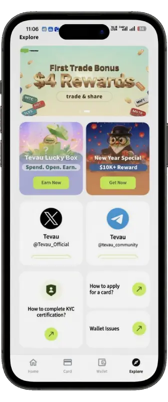
The redesigned Explore tab is a standout addition. It’s not just a promotions page — it’s a discovery hub. You’ll find:
- First Trade Bonus — Earn $4 in rewards just for making your first stock trade
- New Year Special — $10K+ reward campaigns for active users
- Community links — Direct shortcuts to Tevau’s official X (Twitter) and Telegram channels
- FAQ shortcuts — Quick answers for KYC certification, card applications, and wallet issues
This is a smart design choice. Instead of burying promotions or support links deep in settings, Tevau surfaces them where users are already browsing. It reduces friction and keeps users engaged with the platform’s growing ecosystem.
The “More” Menu: Everything, Organised
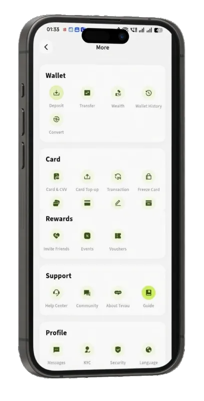
Tap More from the home screen and you’ll find a neatly categorised feature grid replacing what used to be a harder-to-navigate list. Features are now grouped into five clear sections:
- Wallet — Deposit, Transfer, Wealth, Wallet History, Convert
- Card — Card & CVV, Top-up, Transaction history, Freeze Card, and more
- Rewards — Invite Friends, Events, Vouchers
- Support — Help Center, Community, About Tevau, Guide
- Profile — Messages, KYC, Security, Language
It’s the kind of organisation that makes the app feel grown-up and considered — especially for users managing multiple financial activities across fiat, USDT, and stock holdings.
First Impressions: A UI That Respects Your Time
The new Tevau interface isn’t just a cosmetic refresh. It reflects a clearer understanding of what users actually need: fast access to balances, simple navigation, and meaningful rewards that are easy to find and use.
Whether you’re topping up your Tevau Plastic Card for travel, tracking your USDT-Wealth portfolio, or exploring the latest cashback promotions, the updated UI makes every interaction feel more deliberate and less cluttered.
New to Tevau? The app is available for iOS and Android, offering a USDT-powered debit card, multi-asset wallet, and a growing suite of financial tools — now wrapped in one of the cleanest fintech interfaces in the market.
Want a closer look at the Wallet and Card features specifically? Read our deep dive: Tevau Wallet & Card Features Explained — Everything You Need to Know